This article is sponsored by Muffin Group.
You’ve become a pro at creating multi-page websites, a few quite large ones perhaps. Suddenly, you’re faced with building a one-pager. Piece of cake – right?
Not so fast. Getting a message across in 5 – 10 pages is one thing. Getting a similar message across in a one-page website is a different animal entirely. If you do anything less than making a stellar effort, most of your visitors won’t make it to the bottom of the page.
It takes planning, which is what the following guide is all about. Our guide addresses 5 critical elements that can make or break your design.
Take them seriously, and you should come out just fine.
5 Critical Elements that Can Make or Break Your Design
#1 Identify the GOAL and Work Toward It
You can start designing your page before you’ve nailed down what you want it to achieve. But then you’re going to break a cardinal rule digital design and development rule. It is “If you don’t know what you’re doing, don’t do too much of it!”
In other words, if you don’t have a goal in mind, you’ll be wasting your time. For a one-page website, it should be a single goal; whose purpose is to:
- Sell something
- Announce an event
- Present a portfolio
- etc.
Once you have a clearly-defined goal in mind, you’re far less likely to do dumb things as you proceed with your design.
Tip: Watch out for anything that could slow down page loading. Some special effects are notorious for that.
Bistro Agency
This one-page website features an above-the-fold interactive effect that doesn’t slow down its load speed.
Be Moving 3
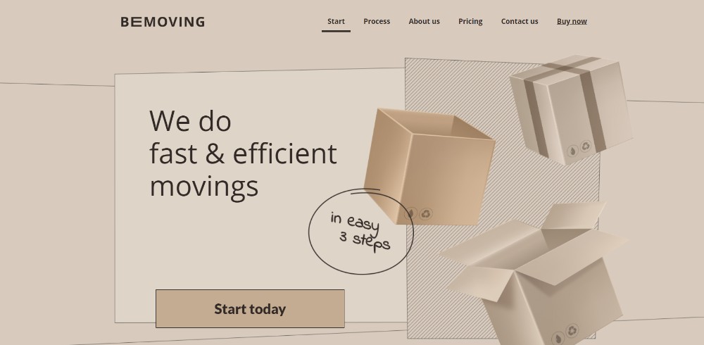
This BeTheme one-pager’s features include a static image that appears to be dynamic. As such, it won’t slow down the page load speed.
Think Pixel Lab
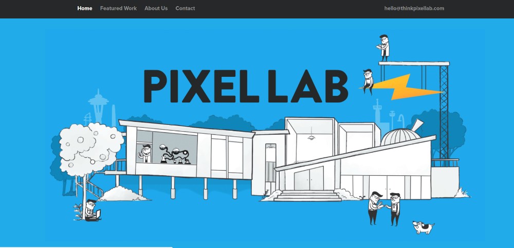
These tiny animated items liven up this page’s illustration. They do not slow anything down, but it always pays to check.
Be Product 2
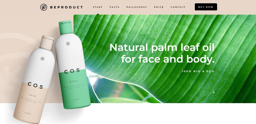
A fresh look can make a great selling point.
Sheerlink

This page demonstrates how engaging large images and sliding panels can be.
Be App 4
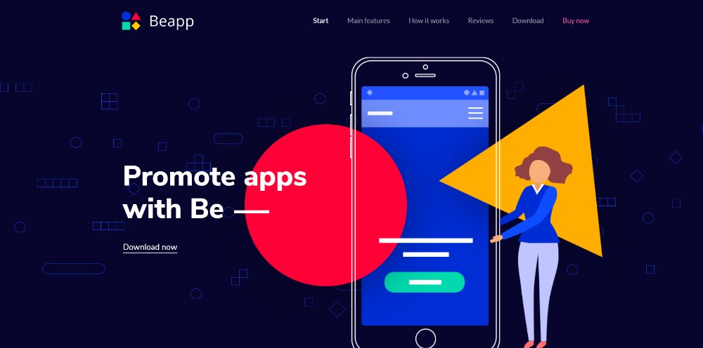
A lengthy (and likely boring) technical dissertation isn’t required to successfully promote an app, when a cool presentation like this is all it takes.
#2 TEXT: Keep Text to the Minimum & Make Sure It’s Easy to Read
There are more or less than 7 sins in one-page website design, and clunky blocks of text certainly is one of them. Users aren’t going to drink a second cup of coffee while attempting to navigate your one pager. Rely on bold headlines, brief paragraphs, bullet lists, and images. You can get your message across.
Dangerous Robot
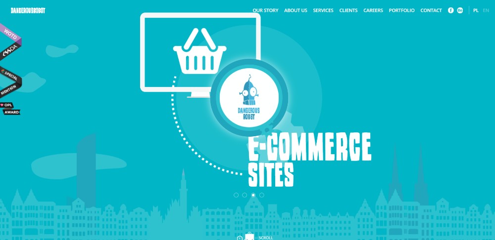
This website is so entertaining that it’s worth going through a second time, and maybe a third.
Be Tea 3
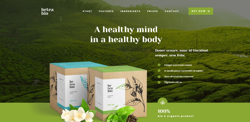
Neat organization combined with a page’s fresh look can make a sale.
Hello Alfred
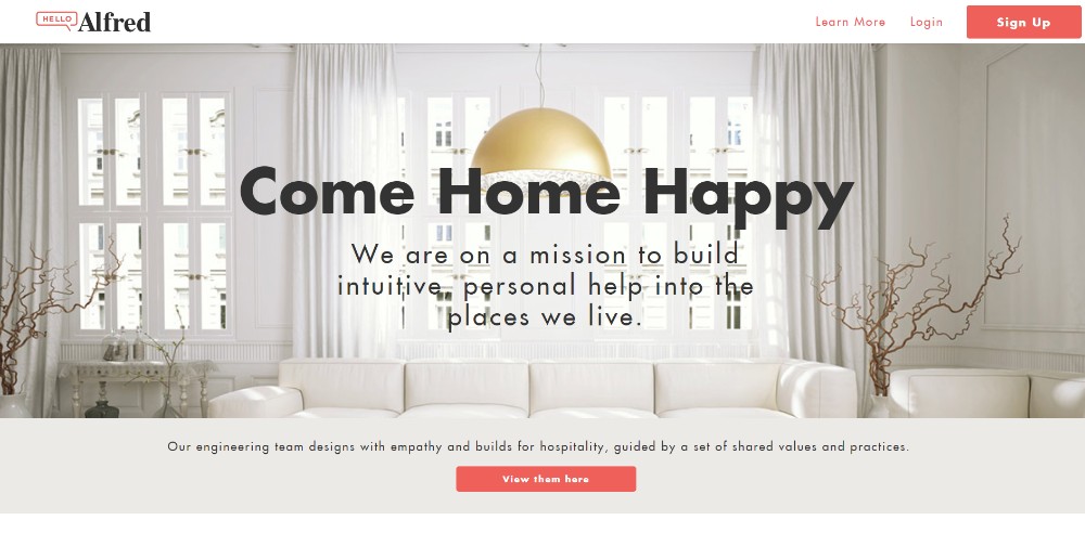
Key information is kept above the fold. Bullet lists help to keep the message concise – and save space.
Be Cakes
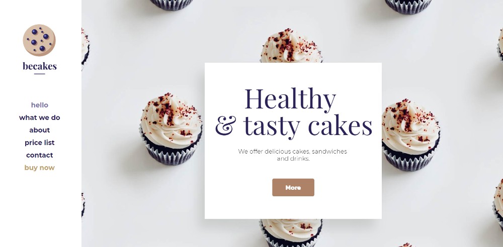
Large attractive images like this accompanied by judiciously placed paragraphs of text can produce a sudden urge to buy some cupcakes.
Mercedes-Benz
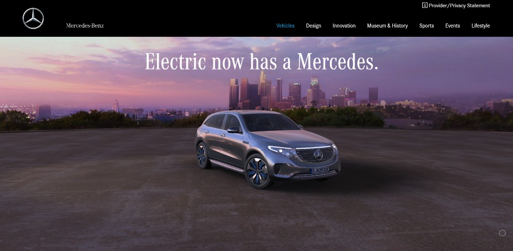
When you’re advertising a Mercedes or any luxury vehicle you can afford to focus more on high quality imagery and less on text.
#3 VISUALS: Identify the Right Patterns & Use Negative Space Wisely
People scan images in a Z pattern and follow text in an F pattern. You’ll want to keep this flow in mind whenever you mix elements. The reason for doing so is your goal should be to attract attention to the most important stuff.
Chris Connolly
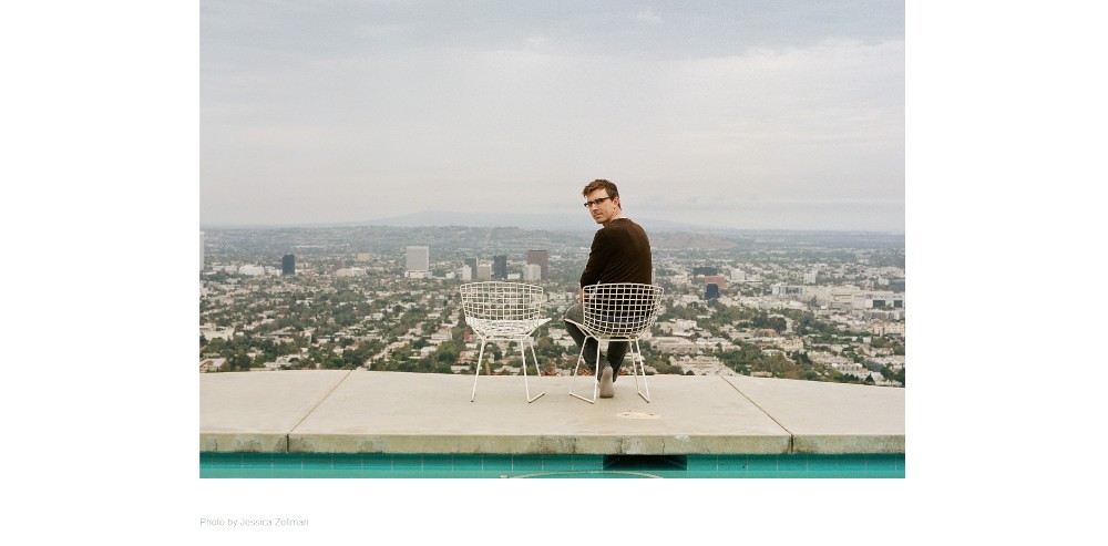
White space can be an invaluable aid in your attempt to achieve a sense of order.
WeShootBottles.com
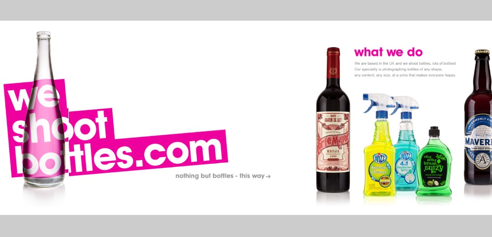
Here, white space serves as a canvas for enthusiastically creative content.
Be Dietician 2
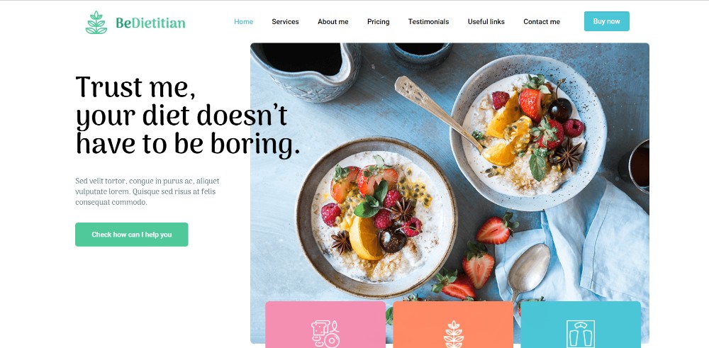
Another one-page example of how white space can be used to maintain a sense of order; and also make various design elements and sections appear to pop out.
Dribble’s Year in Review
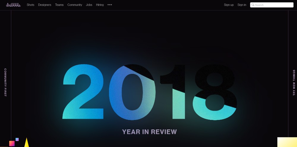
Here’s how a mix of different design principles can create an amazing visual splash. Not easy, but fun to try, plus you can learn from it.
Nasal Drops
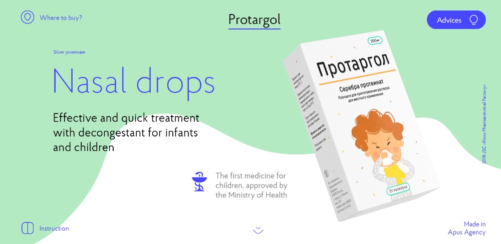
Trying to produce a page promoting nasal drops that excites? It’s actually doable! This page does so with an ingenious use of slides, animations, and white space.
#4 NAVIGATION: Making It Easy to Navigate and Entertaining to Scroll
You might think the smaller the website, the easier the navigation will be. A one-pager is a potential minefield in this regard. Get it right, and users stay engaged, get it wrong and you’ll chase them away.
Make alternative navigation a design objective. Avoid a search-by-scrolling design approach. Instead, let visitors jump from one section to another with a single click. You can also make good use of sidebar menus, sticky menus, and auto-scrolling nav-links. They can help your visitors out.
Sergio Pedercini
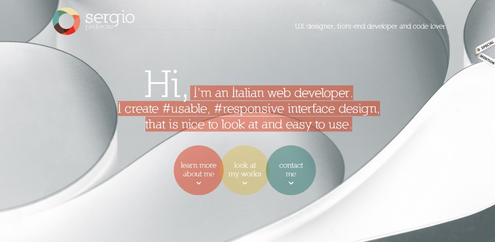
This website uses 3 different auto-scrolling links.
Be Game
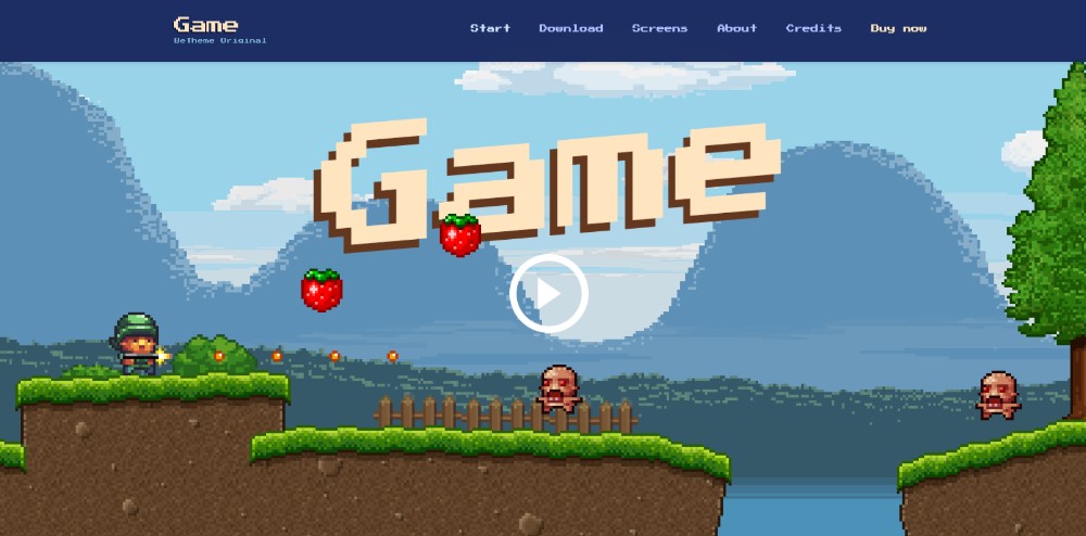
You Be Game’s navigation experience is user-friendly and, at the same time highly entertaining.
Be Landing 2
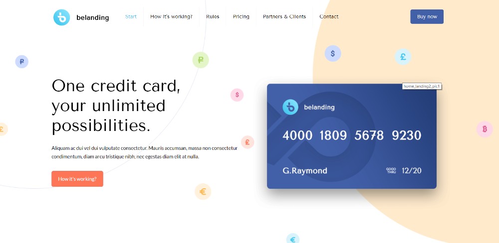
Be Landing 2 demonstrates how to scan a page with 3 mouse scrolls.
Brainflop
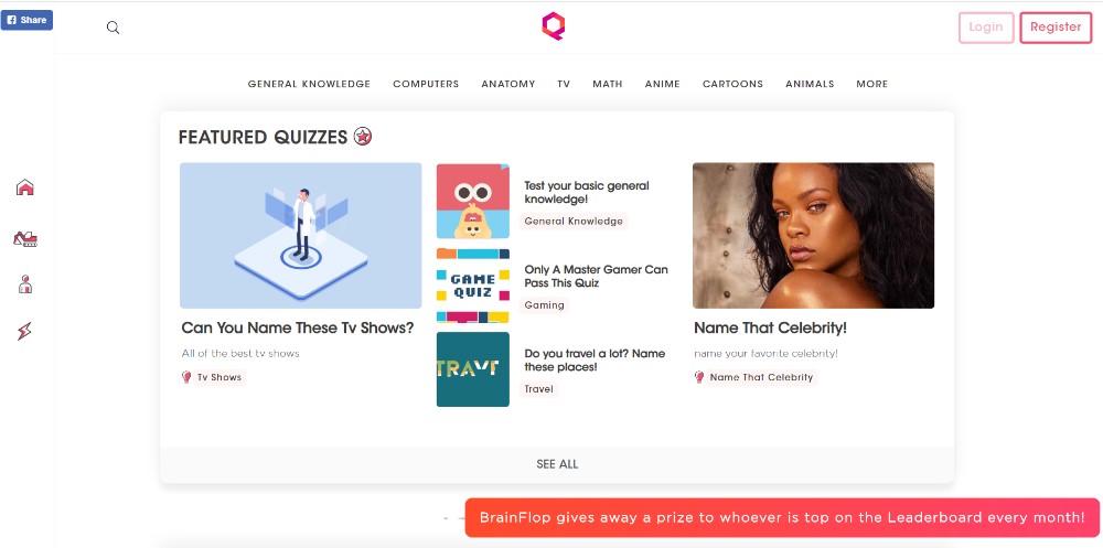
Visitors will find the menu on the top and one on the left makes navigating the site especially easy.
#5 CALL TO ACTION: Identify the type or style of CTA you want and don’t hesitate to use it.
We initially addressed the need for a goal. Here we address the final step toward meeting the goal. It’s the CTA button or buttons. You want them above the fold, and you want them to stand out.
The aim of a one-page website’s design is to direct its visitors toward a single action. This calls for a single CTA button. There are exceptions of course; multiple product buttons and “Learn More” buttons. Most one-pagers, however, have a single purpose and a single CTA button.
Be Hairdresser
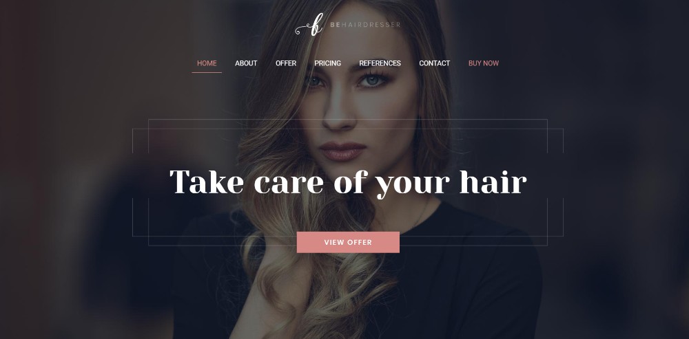
In Be Hairdresser the CTA button is placed above the fold. Note: There is also one in the menu.
The Art of Texture
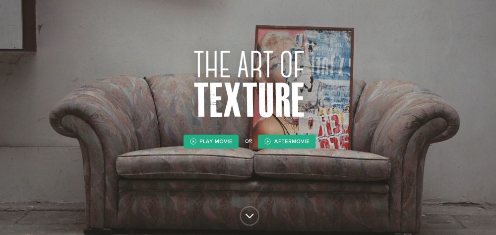
Two CTA buttons are used here to give a user a choice.
Pyrismic

A busy design. Nevertheless, the CTA button stands out.
Reneza
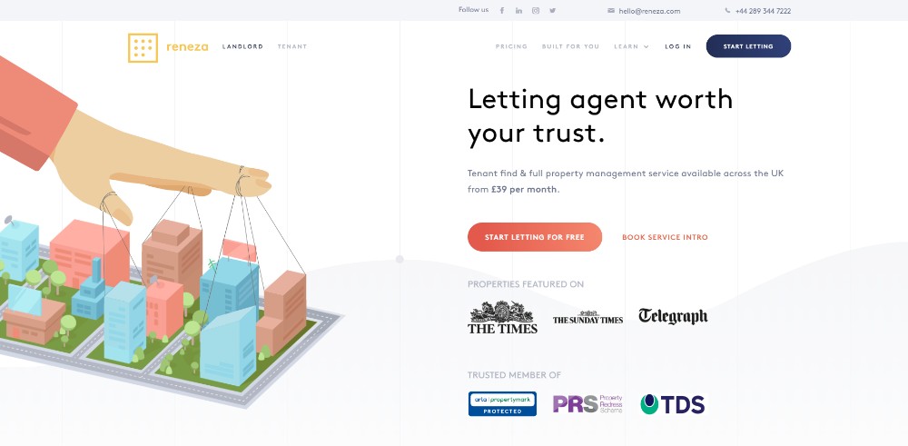
Reneza uses CTA buttons judiciously and with a mix of colors and text sizes.
Wrapping It Up
Make it a point to keep these 5 critical elements in front of you. At least until practicing them becomes second nature. As we mentioned up front how you apply them can make or break your design. Neglecting just one break your design just as easily as neglecting all 5.
Following all 5 can admittedly be tough, in which case, there’s a shortcut you might find appealing. It involves using pre-built websites that have already incorporated all 5 elements.
Be Theme features a huge library of 400+ pre-built websites. This includes more than 60 one-pagers. The critical elements are already taken into account. Every pre-built website can be customized to fit your needs.
This article is sponsored by Muffin Group.