Full Disclosure: This article is sponsored by BAWMEDIA.
Web designers: the future is bright. The need for business websites is rapidly growing due to an increasing number of startup initiatives.
These startups are more global in outlook and digitally oriented than in years past. Companies that create these startups urgently need websites. And they are flexible in design and conversion optimized in practice.
The good news for you lies in the opportunity to be of service to these new businesses. It’s now easier to create eye-catching and engaging websites that are designed to accelerate their sales funnel.
More good news: Building a website for a startup can be done in 5 simple and straightforward steps.
Check out the following examples of existing websites, and tools you can use to quickly and easily build similar websites.
5 steps to creating truly amazing business startup websites
Step 1: Select a spellbinding color palette
There is much more involved than simply selecting a palette that pleases you. It has to please the startup owner, and to do so it must adhere to the following rules:
- It should instantly attract attention
- It needs to match the business’s brand, and
- It needs to support and not detract from the messages put forth.
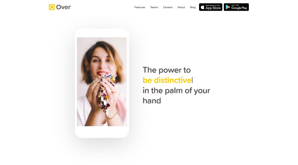
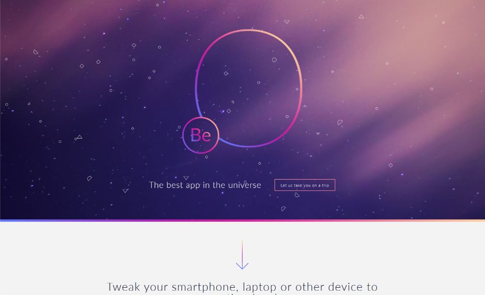
Over has BOLD color touches that immediately draw attention.
This pre-built website – found in the Be Theme library – is another excellent example of an eye-catching color palette.
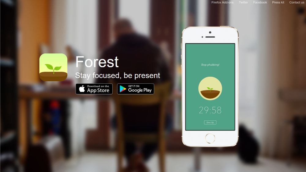
Forest cleverly aligns the color palette in its website with its brand by using rich and memorable earth tones like greens and browns.
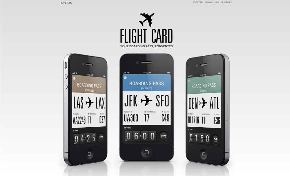
FlightCard, on the other hand, goes with a delicate, cold color palette. This is ideal for reinforcing their message: boarding passes have become so easy to use that you can almost (but not quite) ignore them.
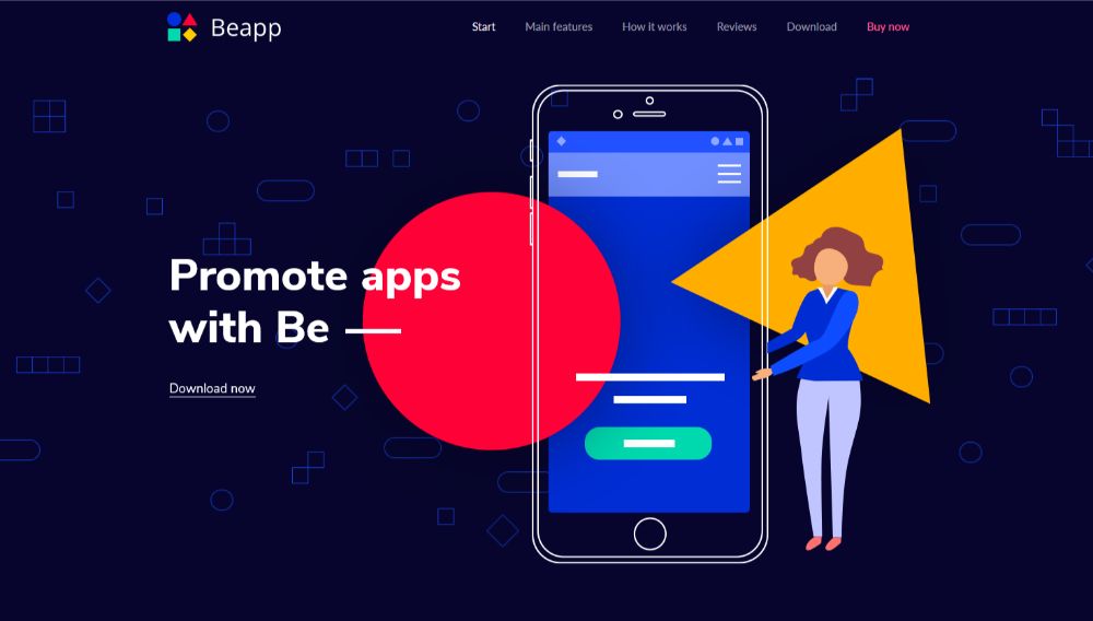
And, if you’re searching for a color palette that would appeal to a larger audience, BeApp2 can be a good starting point for your website.
Step 2: Display crystal-clear product pics
This one’s obvious.
If you’re trying to see what a product looks like, you probably want to see EXACTLY what it looks like. It is the same for how it works or for an image that shows a service being provided. A poorly chosen image or one that isn’t clear and sharp can reflect negatively on the business.
The following examples show how to give startups an extra edge against big companies with big budgets.
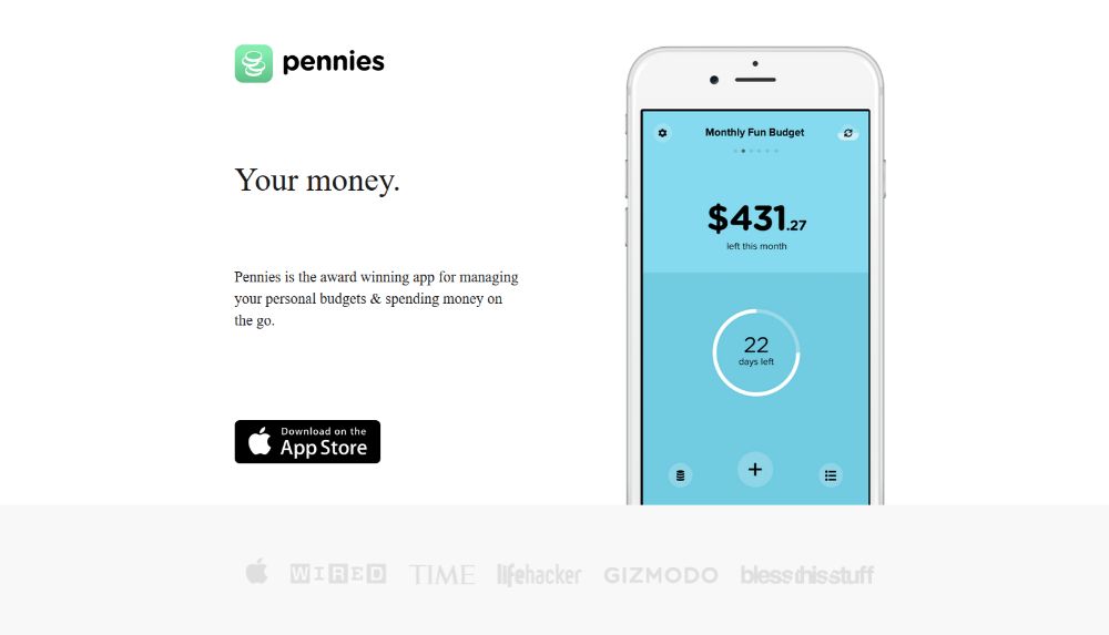
Pennies proudly displays the site’s appearance on a smartphone. You can even tell how easy it is to use and get an understanding of how the color codes work.
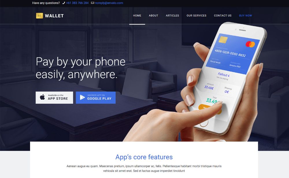
You can create an analogous website with BeWallet. It is a pre-built website specifically designed with financial service startups in mind. There’s no shortage of those that have an urgent need for an improved website.
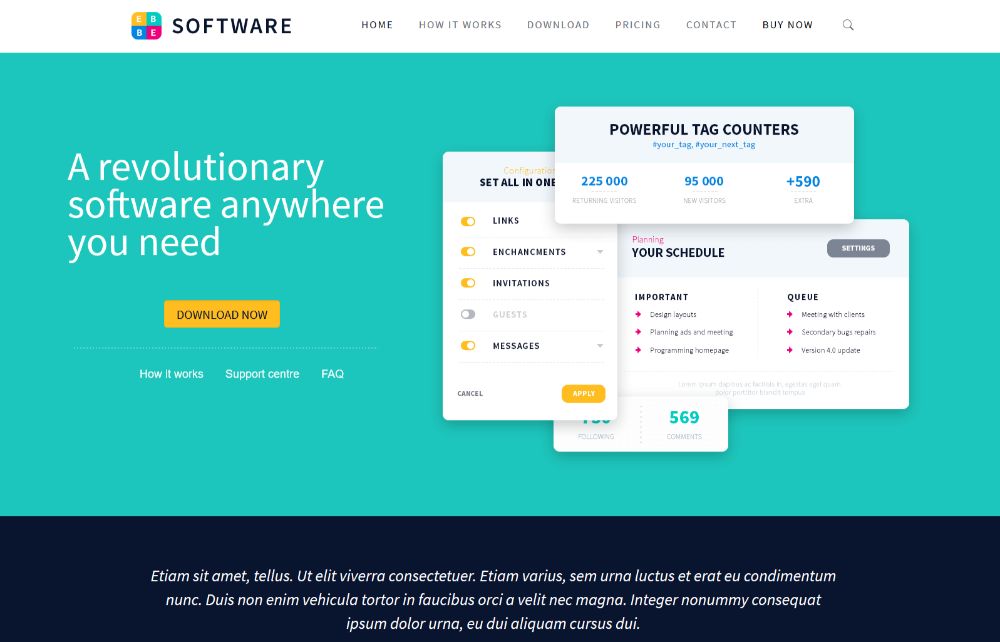
You could also consider a more wide-ranging pre-built website like BeSoftware to present a new startup’s crystal-clear pics.
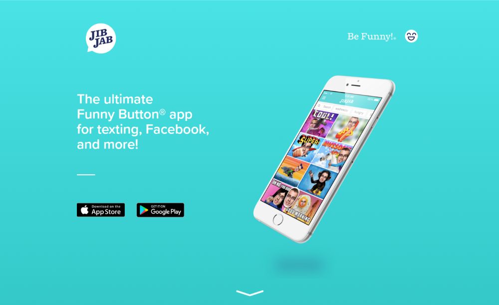
JibJab takes things a step further. This website chooses a before & after to show what the startup business can offer its customers.
Step 3: Show visitors how the new startup serves them
Showing people what’s in it for them is a powerful approach in that it enables visitors to imagine themselves as real customers.
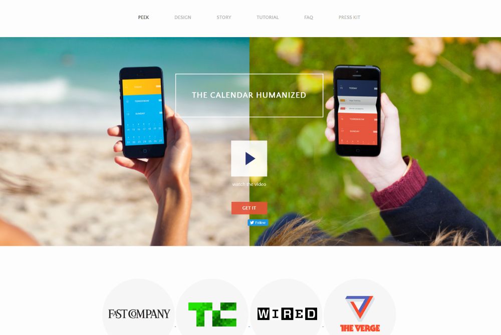
PeekCalendar has a “hero-section” video. This illustrates the benefits people receive from the hands-on elements of the new business.
BeApp3 can incorporate product images and videos to show people how a company’s products and services will benefit them.
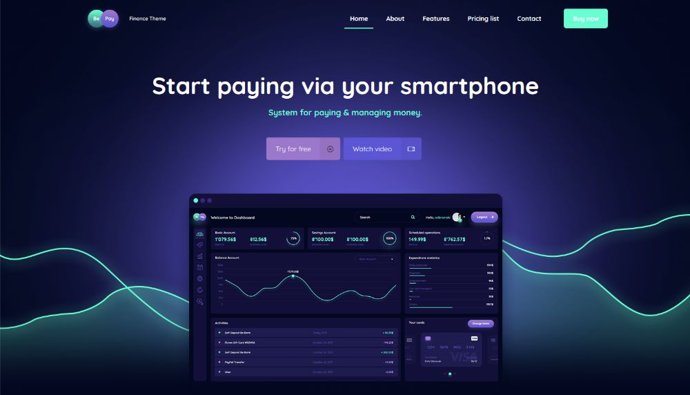
BePay has placed a Watch Video CTA button directly above the fold, so visitors can view a product demo immediately.
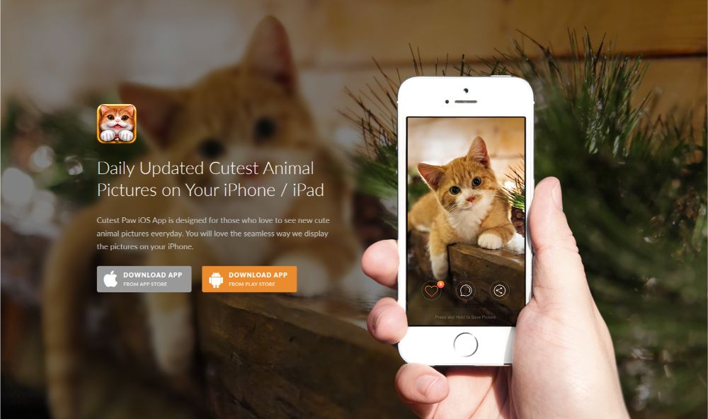
CutestPaw is a pet lover’s dream. The entire demonstration is cleverly rolled up into a single, “melts-your-heart” image. It is a hero shot that cleverly illustrates how this new business meets a customer’s specific need.
Step 4: (Over)use “white” space
It’s difficult to make too much use of white space in a startup’s website. This #1 visual element can be used to powerfully highlight the website’s principal messages and product shots.
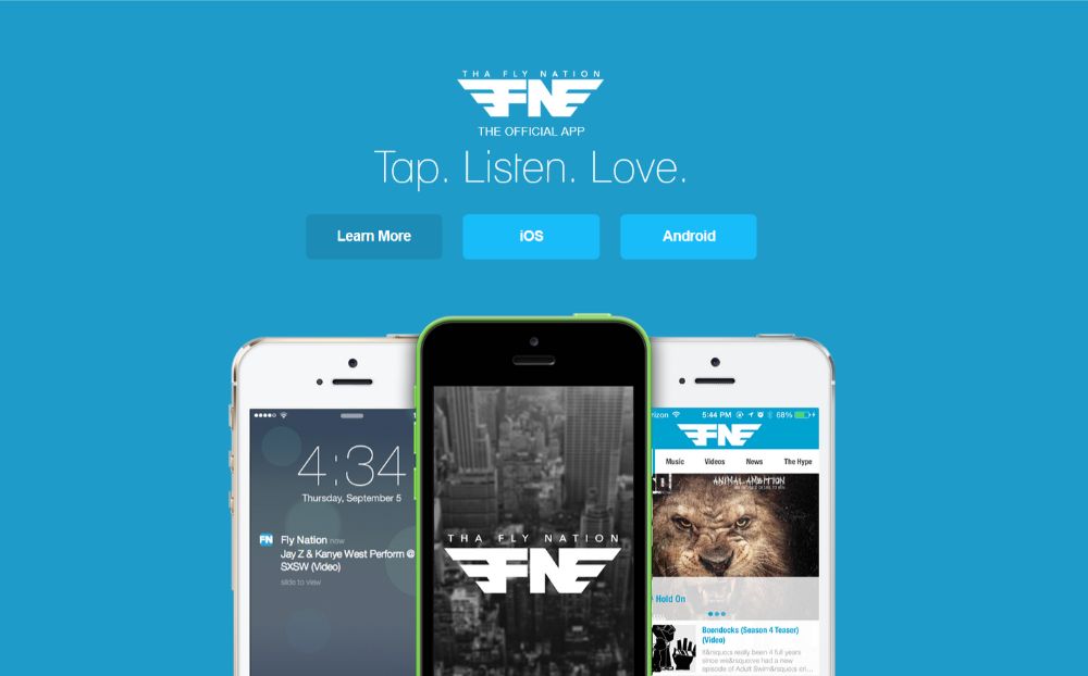
Tha Fly Nation’s clean, airy design allows the eye to automatically focus on the site’s most important elements.
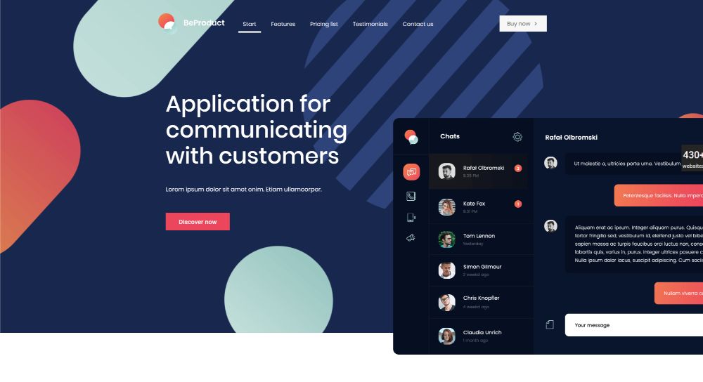
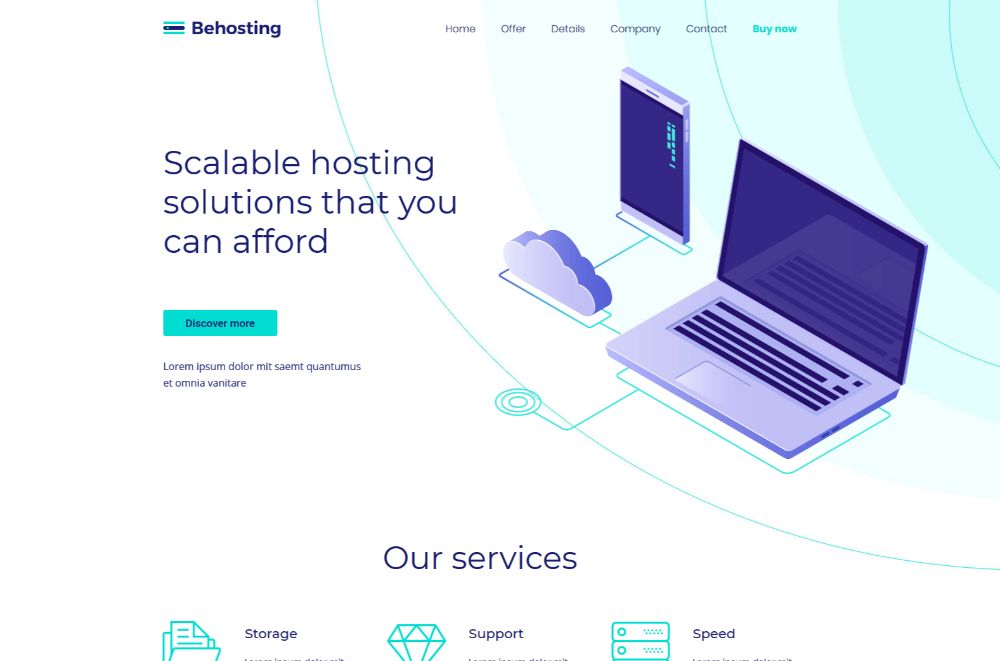
You can produce similar startup website effects with either BeProduct4 or BeHosting2. These are two pre-built websites where an ample amount of white space is used to enhance the UI and UX by emphasizing the critical elements on the page.
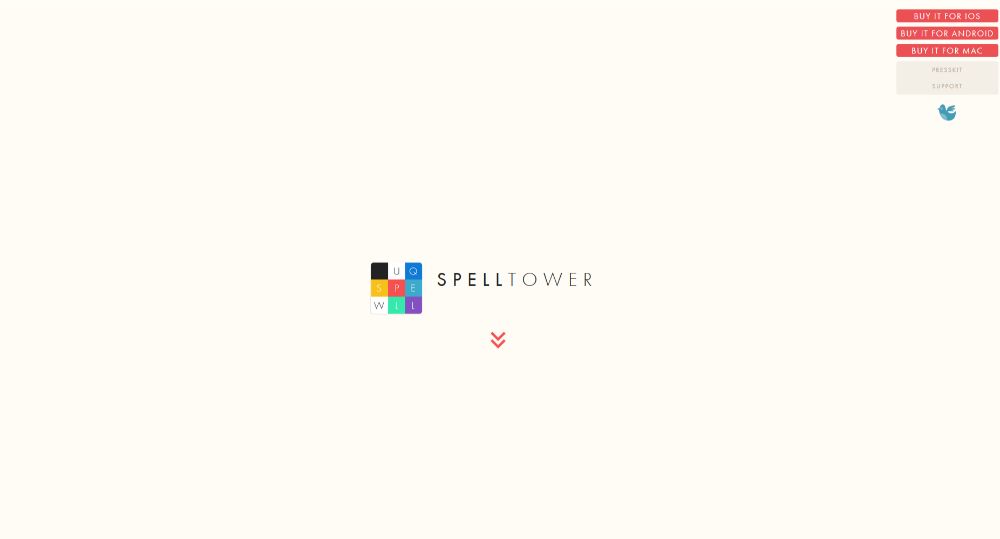
SpellTower is likely THE most extreme example you’ll come across in the effective use of white space. It’s part of their brand and it does an excellent job of driving the message home.
Step 5: Make your CTAs grab them by the eyeballs
There are CTA buttons that are easy to find, and those that simply can’t be ignored. You should opt for the latter, and make them big, bold, and sunshine bright. In doing so you can make it hard for a visitor not to click on them.
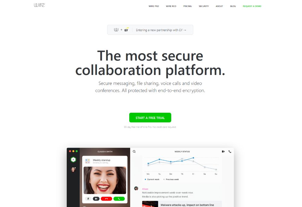
Wire’s CTA button clearly stands out. It’s positioned right above the fold, has a bold color, and is big enough to draw your attention instantly. Since it’s centered on the page, it serves as a “gate” that must be clicked to proceed.
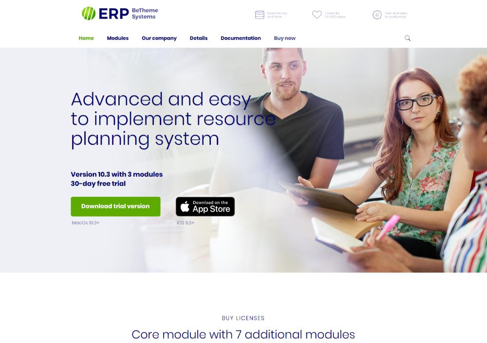
BeERP uses exactly the same bright-green button for its main CTA, the one you want visitors to click. The secondary, plain button on the right gives visitors an option. It does not, however, “compel” them to click.
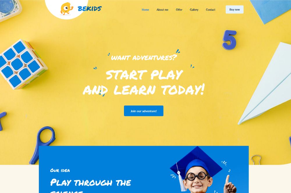
Another effective approach is to have the color of your CTA button match other elements on the page. BeKids matches the blue of the CTA button with some of the visual elements in the hero section.
Conclusion
These steps are surefire ways to build eye-catching startup websites designed for conversion. It’s not difficult to create a website that will attract attention with the stunning visuals and clever use of white space. These persuade the right people to enjoy the services and products it offers.
If you’re working under a tight deadline or find yourself juggling multiple projects, you can effectively use a pre-built website.
Just choose from Be Theme’s impressive gallery of over 450 pre-built websites and customize your selection to your liking.
These websites are functional and impressive due to their interactive elements, stunning effects, and intuitive navigation. Simply personalize one to fit your business and you’re good to go!
Full Disclosure: This article is sponsored by BAWMEDIA.