Full Disclosure: This article is sponsored by BAWMEDIA.
You’re used to building multiple-page websites. Suddenly, you get a request for a one-pager. That should be a nice break, and not difficult at all. Right?
In fact, building a one-page website takes more effort you spend to build a multi-pager. As you’ll see as we go down the list of critical elements involved. There’s plenty to think about. Satisfying all of them in your one-pager takes plenty of planning and attention to detail.
A few substandard pages in a multi-page affair may not prove costly. But if you mess up a one-page website by not following these basic principles, you could pay a heavy price. Here’s what’s involved:
5 Critical Elements that Can Make or Break Your Design
1. The GOAL: Identify the Website’s Goal & Work Toward It
Before you even sketch out a preliminary design on a napkin, you need to have a goal in mind. That applies to almost any project, and designing a website is no different.
Let’s say you have your one-page website’s single goal in mind. Now, you can begin planning the structure that drives the user journey toward it.
Is the goal to sell or promote something, present a portfolio, announce an event, or something else? Once that’s settled, you can focus on how to engage users and what to avoid that might convince them to go elsewhere.
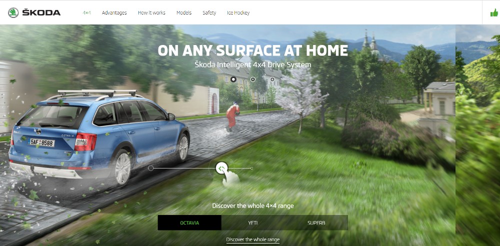
As an example: Many users are sensitive to page load speed. They become impatient if a stunning parallax effect is slowing page loading down.
Bistro Agency
This website uses interactive effects above the fold in a way that doesn’t drag down its load speed.
Be Moving 3
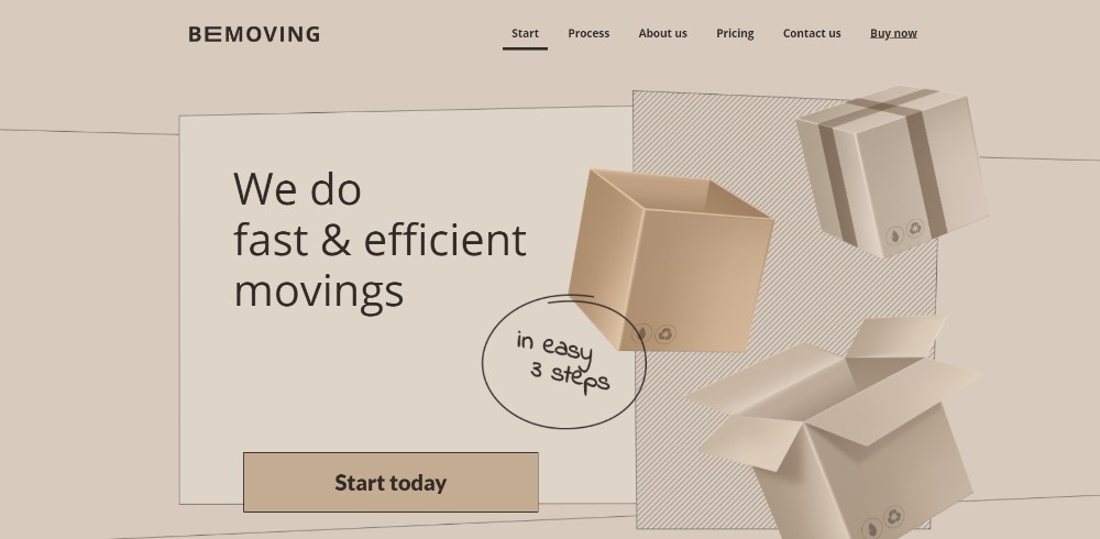
This Be Theme pre-built one-page website features an image that looks dynamic. Hint: It’s static.
Think Pixel Lab
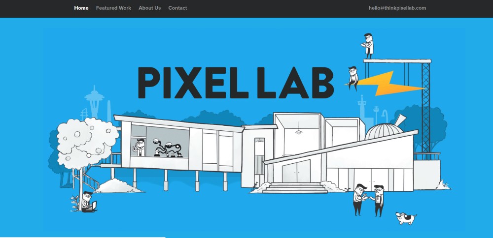
Tiny animated items add sparkle to this page without slowing load time.
Be Product 2
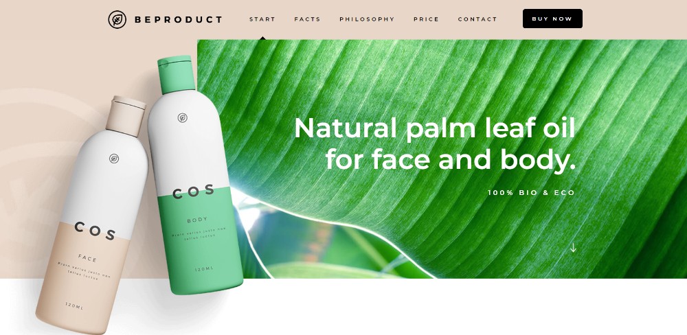
Here’s an example of where a page’s fresh look is all that’s needed.
Sheerlink

This Sheerlink page illustrates the positive role large images and sliding panels can play in engaging users.
Be App 4
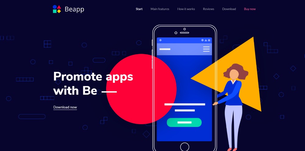
You don’t need a long-winded technical discourse to promote an app. Vivid colors and a genuinely cool presentation more than suffice.
2. TEXT: Keep It to the Minimum & Make It Easy to Read
A one-pager is not a place you’d want to load down with clunky blocks of text. Text should be stripped down to the bare minimum and nicely spaced for easy reading.
The essence of your information can then be presented in bold headlines and bullet lists. You can use short and succinct paragraphs as well.
Dangerous Robot

Every section is so entertaining you’ll want to go through them all again.
Be Tea 3

A prime example of carefully-planned, neat organization.
Hello Alfred

The important stuff is kept above the fold. Bullet lists are used to keep the message concise.
Be Cakes
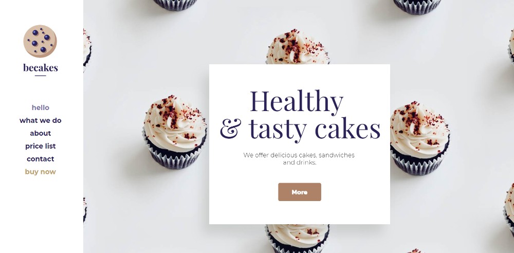
Large attractive images can be excellent selling points when accompanied by short paragraphs of text.
Mercedes-Benz
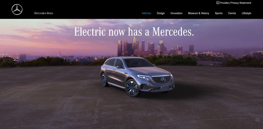
When a vehicle’s brand has the stature of a Mercedes, you can focus more on high quality images and less on text.
3. VISUALS: Identify the Right Patterns & Use Negative Space Wisely
People read text in a back-and-forth F pattern. They scan visual elements in a pattern that resembles the letter Z.
Awareness of this will help you keep visitors focused on critical things. It can prevent them from being distracted by content that is of secondary importance.
The wise use of white space can be very helpful as you design your one-page website.
Chris Connolly

An example of how white space provides a sense of order.
WeShootBottles.com
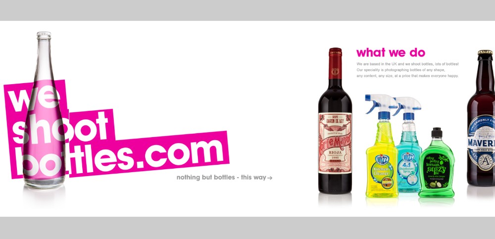
This website is outrageously creative and uses white space as its canvas.
Be Dietician 2
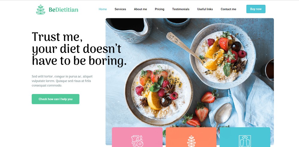
The white space in this pre-built one-page website maintains a sense of order, and also tends to make its various sections appear to pop out.
Dribble’s Year in Review
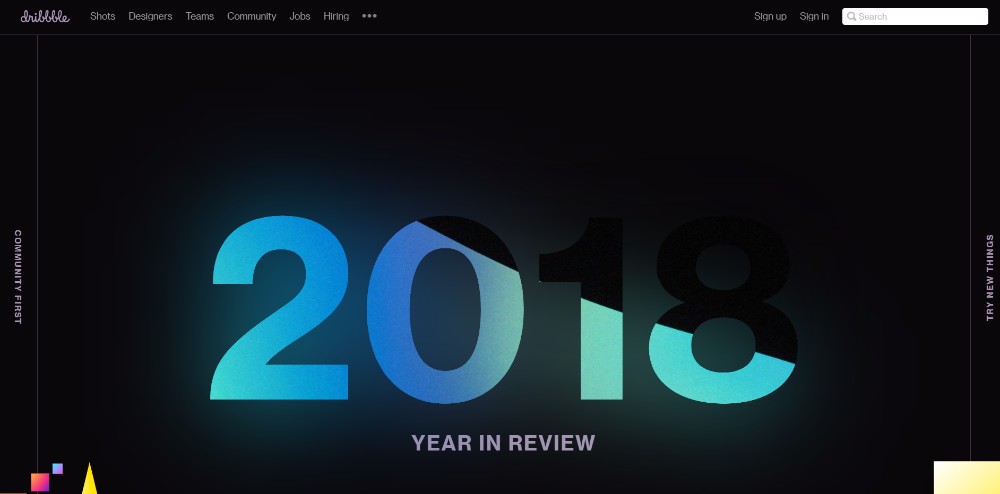
Here’s an example of how you can use an array of different design principles to create an attention-getting visual splash.
Nasal Drops
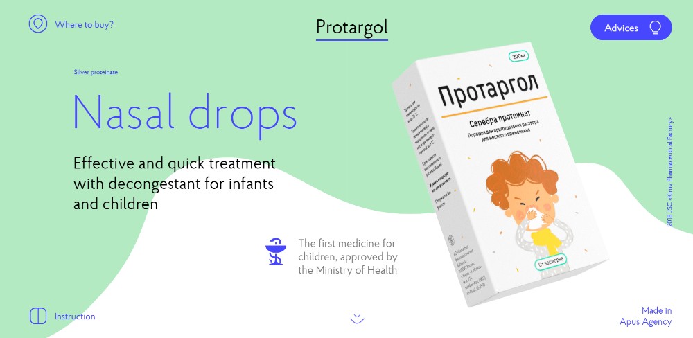
Pages promoting nasal drops rarely excite. This one’s design is outside the envelope, thanks to its creative use of slides, white space, and animations.
4. NAVIGATION: Make It Easy to Navigate & Entertaining to Scroll
You have to be careful when designing a long-form one-pager. Your navigation techniques should keep visitors engaged.
Alternative navigation offers a sound approach. It allows people to jump to another section with a single click as opposed to scroll and search. An auto-scrolling nav link is a nice way to go. It gives users a mild sense of empowerment when they click on it. They can then watch the page scroll to a different section.
Here are a few good examples of user-friendly navigation:
Sergio Pedercini
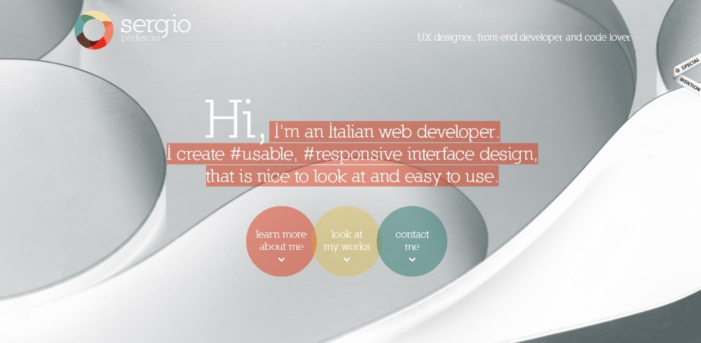
This designer’s website utilizes several different auto-scrolling links.
Be Game
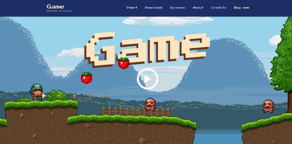
Be Game’s navigation is both user friendly and entertaining.
Be Landing 2
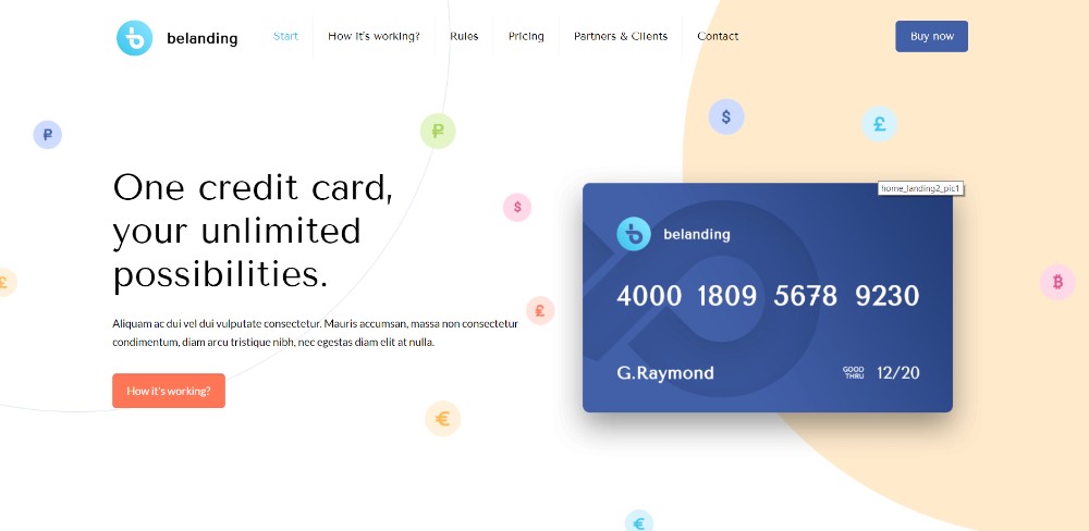
A cool color scheme, the layout structure, and scanning the page with 3 mouse scrolls make this pre-built website special.
Brainflop
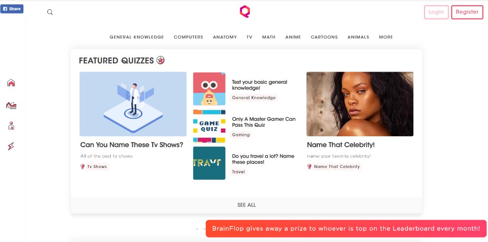
To help you navigate their site quickly, the Brainflop folks provided a menu on the top and a menu on the left.
5. CALL TO ACTION: Identify the Appropriate CTA & Don’t Hesitate to Use It
You started by defining the goal of your website. Now it’s time for closure and deciding how to use CTA buttons. You should be able to steer people into taking the necessary action to satisfy that goal.
Most one-pagers direct people toward taking a single action. This is to view a portfolio for example. Other one-pagers may require a CTA button at the end of every section.
In most cases, you’ll want to position CTA buttons above the fold.
Be Hairdresser

In the Be Hairdresser pre-built website, the CTA button is above the fold along with a button in the menu.
The Art of Texture

Two CTA buttons are placed above the fold to give users a choice as to what they want to see.
Pyrismic

Pyrismic uses a simple opt-in form that features a bold CTA button.
Reneza
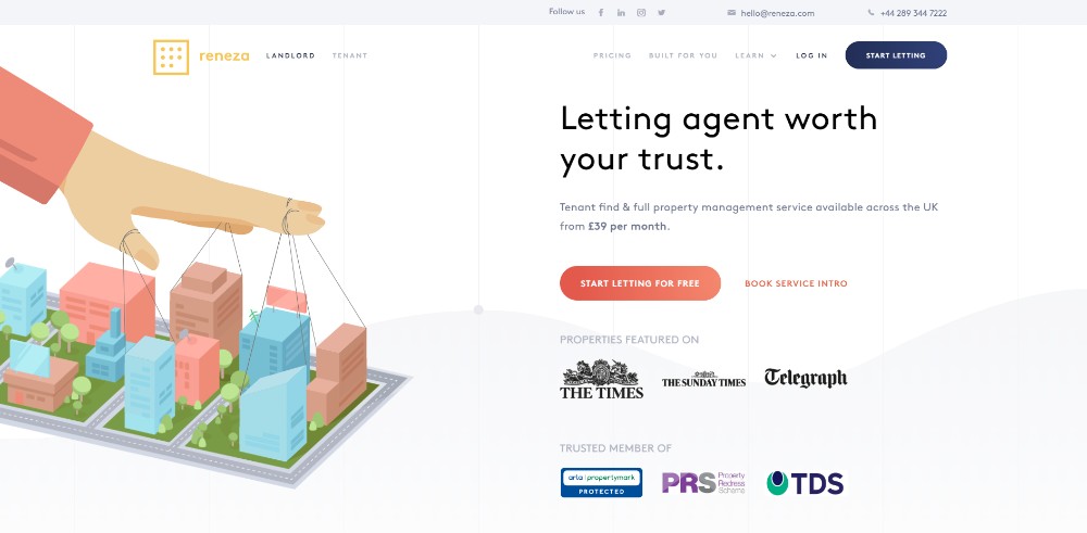
This site doesn’t fool around when working with CTA buttons. They use them judiciously, but with a nice selection of colors and text sizes.
Wrapping It Up
Make it a point to understand the reasoning behind the 5 elements discussed here. Put them into everyday web design practice. You’re guaranteed to come out ahead any time you’re given the opportunity to put a one-pager together.
Mixing all 5 can be tough at times. But you can take a shortcut! How? By using pre-built websites that already incorporate these elements.
A good pre-built resource is Be Theme. Its extensive library of 400+ pre-built websites of all kinds includes 60+ one-pagers. You can customize all of them to fit your needs.
Full Disclosure: This article is sponsored by BAWMEDIA.